People decide within seconds whether a cafe or restaurant website looks inviting. Images play a big part. Here is how to choose them without spending a lot.
Start with the mood, not the dish
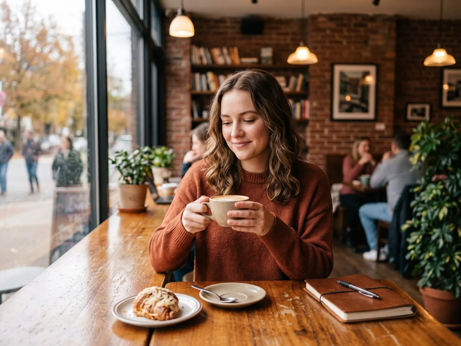
Decide what you want visitors to feel: relaxed and cosy, modern and quick, romantic or family friendly. Choose a hero image that matches. Our cafe and coffee collection has window seats, coffee cups and people working in cafes, which suit relaxed coffee shops and co-working cafes.
Home page: one strong hero image
Use a single wide image at the top, with space on one side for the name, opening hours and a "reserve" or "order" button. Do not place text over the busiest part of the picture.
Menu page: use your real food
Customers expect the dish to look like the photo. For menu items you actually sell, use your own photographs. Illustrated or AI-generated dishes should be limited to decoration such as section headers, so you do not mislead anyone.
About and story page
This page can use atmosphere images: coffee being poured, ingredients on a table or a quiet corner. Add a few honest lines about who you are, where your ingredients come from and what makes the place different.
Social media
- Use square or portrait images for posts, and vertical images for stories.
- Keep a consistent colour tone so your feed looks like one brand.
- Add the day, offer or event in a short text overlay.
Speed matters
Large images slow down a website, especially on phones. Use a size close to what you display, compress the file, and let images below the first screen load only when the visitor scrolls (lazy loading). On Pixvora you can download a preset size instead of the huge original.
What to avoid
- Pictures with someone else's logo or brand name on cups and packaging
- Images that show a different cuisine from the one you serve
- Too many different styles on one page
- Presenting AI people as real customers or staff
For food-focused pictures, also see the Italian food and gourmet collection.